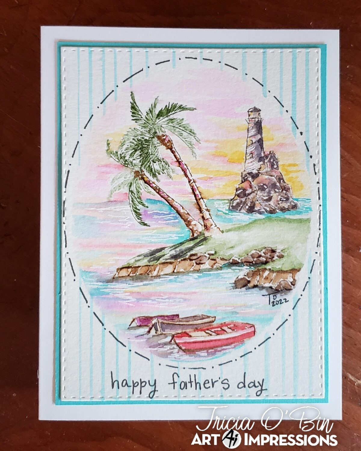
Welcome back watercolor fans! I decided to try something a little bit different this weekend. I wrote my “How-To” while I was creating. I decided to leave it organic and not proofread and change anything. You can see my process as it happens. Here goes, this is a Father’s Day Lighthouse card for my husband.
I cut a mask with my masking paper and the stitched rectangle die. I laid it over my watercolor paper (the negative not the circle. I will save the circle mask for another project.
I inked the small cliffs with 969, 177 and 569. Next, I inked the big and small trees from the palm tree set. I stamped the large one on an angle and then the smaller one on a little more of an angle. Using the medium palm stamps I inked them with 177 and stamped them on either side of the tree.
Next, I inked the medium lighthouse with the rocks, stamped it off, and stamped it to the right of the trees, a little higher to create the illusion of distance. Next, I inked the boats from the bait shop set with 969 and stamped them towards the bottom of the oval.
To create the palms, I used the medium and small palms from the palm tree set inked with 177.
Pull the color out of the lines.
-
-
- I started with the lighthouse. It’s the first layer so I went really light and just pulled some darker areas out.
- Next, I worked on the small cliff. I started with the rocks, keeping it really light. Next the sand going into the water. I pull color from the top near the grass down towards to water, leaving lots of white space. You can always add more color. Next, I pull color out of the grass.
- Boats and Palm Trees
-
I decided to add the water before I add more color. I want to try to keep it light..ha ha here goes.
I am starting with 451, again keeping it light. I added it around the lighthouse, between the trees and around the land and boats. Next, I used 025 (yellow) to add some clouds and color to the sky and then to the water. I kept this really light.
I added some 177 from my palette to the hill behind the palm trees. With the water dry, it was easy to picture where the hill would be.
Next, I added 865, 685 and 373 to the sky and water. I added some additional color to all the elements and then my light watercolor went a little deeper (oh well, I still like it). To brighten some of the reflections, I added some white gel pen. I signed and dated it.
I removed the mask, cut it down, mounted it to a Gina K Designs card stock mat and adhered it to the card base.
Related: Beach Anniversary Card
SUPPLIES: 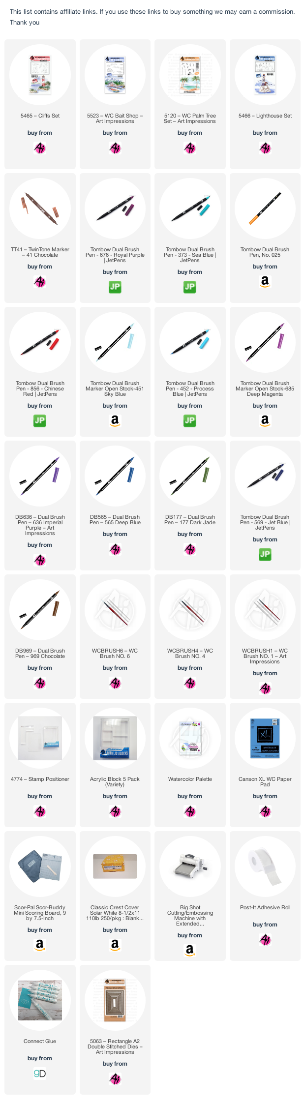
Stunning card for your husband. I always appreciate your work of art. Thanks for sharing. I need more experience on where to place images in regards to size and depth.