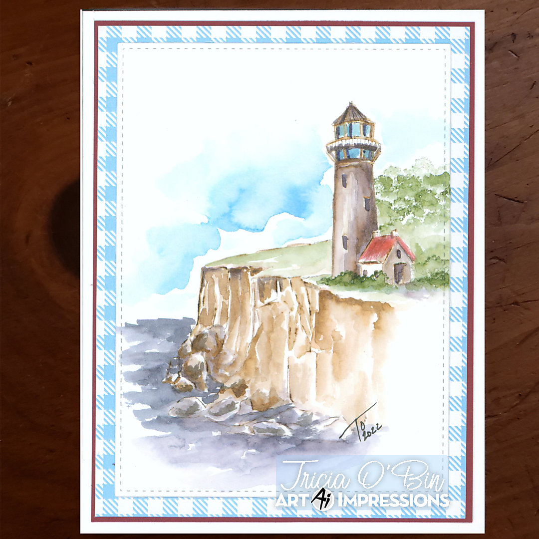
Welcome back watercolor fans! How excited are you for Spring or better yet, Summer 😊 Today I created a quick Lighthouse card for you. I love the lighthouses because they are great for masculine cards. Never can have enough ideas for those men in our lives.
Step 1: The Lighthouse
I started out by inking one of the lighthouses from the set with 969. You can stamp it off if you want a lighter look, but me, I like it dark, so I didn’t stamp it off. Instead, I pulled some color in from the sides and added some additional color from my palette. Make sure the right side of all of your objects is darker as the objects are facing the light source. I added some color to the windows and the house including a bit of red on the roof.
I stamped it again on a piece of post-it tape to create a mask for when I add the foliage.
Step 2: The Cliffs
For the cliffs, I used one of the bigger cliffs. First, I inked the entire stamp with 969. Then I took 569 and added it just to the rocks. I wanted them to be distinguished from the cliff background. The stamp I used is clear, so it was really easy to line it up where I wanted it.
I added water to the rocks and sand using my small brush so I could keep it very controlled. Pull the color out from the lines and add some additional color from your palette where you want things really dark. These cliffs are so much fun to paint. By placing dark color under the grass, it gives the cliff a little more definition.
Step 3: The Foliage and grass
I kept this part simple, I started out by laying a little bit of color from my palette to the ground next to the lighthouse keeping the front a bit lighter. Using the tree line stamp, I inked it with 177 and stamped it several times behind the lighthouse and house to give the look of a forest of trees and then a couple of times in front and to the right of the house. I added water to the lighter treetops first and then to the darker ones.
Step 4: The Water and Sky
The water is the best part. I used a larger brush and lots of water and paint from my palette. There is no wrong way to do water and clouds. The areas around the rocks should be darker. To do the sky, you can approach it a couple of ways, you can lay down water and drop in color from your palette or you can add color directly from your palette and then add water to soften. Paper towels are great for sopping up color and creating cool cloud-like shapes.
Don’t forget to sign and date!
The Card
I cut a mat from Gina K Cardstock (Cranberry Tart) and I had a piece of blue checkered patterned paper laying around (probably from Gina K) that I cut and adhered to the Cranberry Tart card stock. I used the Gina K (Shocking I know) Master Layouts 1 to cut out a stitched border around my watercolor piece. I adhered that to the layered mat and adhered the whole thing to my card base.
Again, an easy card for any occasion and gender. Who doesn’t love a lighthouse? I hope you will give this project a try and I thank you for spending some of your time with me. Have a crafty day!
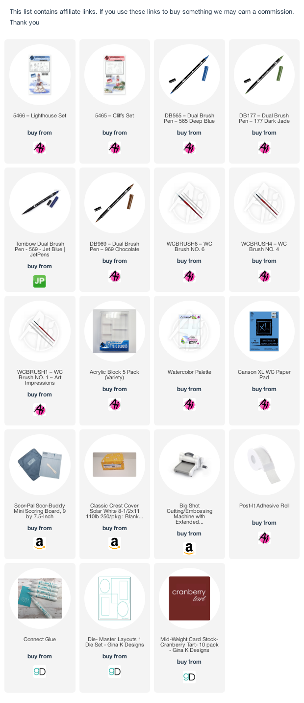
SUPPLIES:
Very pretty. My daughter loves lighthouses so I have quite a few different ones.
I have one of the 1st sets AI ever came out with. Have used it a lot.
I have enjoyed all of your artwork…but this one moves me! The card is great but the clouds and water are totally amazing. Thanks for sharing all the time.